
こんにちはyu_to(@yu_to_python)です。
今回はアプリのUI(ユーザーインターフェース)を構築する上で不可欠なWidgetであるAppBarについて解説していきます。
そもそもWidgetの事について詳しく知らないという方はこちらの記事で詳しく解説しているので参考にしてください。
 【Flutter】UI構築する際の基本Widgetついて解説!【サンプルコードあり】
この記事を最後まで読めばAppBarの使い方や、よく使うプロパティについて理解できると思うので是非最後までよんでみてください。
目次
AppBarの特徴
ヘッダーを簡単作成できる
AppBarは俗に言う「ヘッダー」を簡単に作成できるWidgetです。
ヘッダーにはメイン画面に合った情報を表示させたり、ユーザー動作の補助ボタンが設置されていたりします。
画面それぞれに適切なヘッダーを設ける事はユーザー体験の向上に直結するのでアプリにとって重要な要素になります。
サンプルコード
コピペですぐ動かせるのでまずは実際に動かしてみてください。
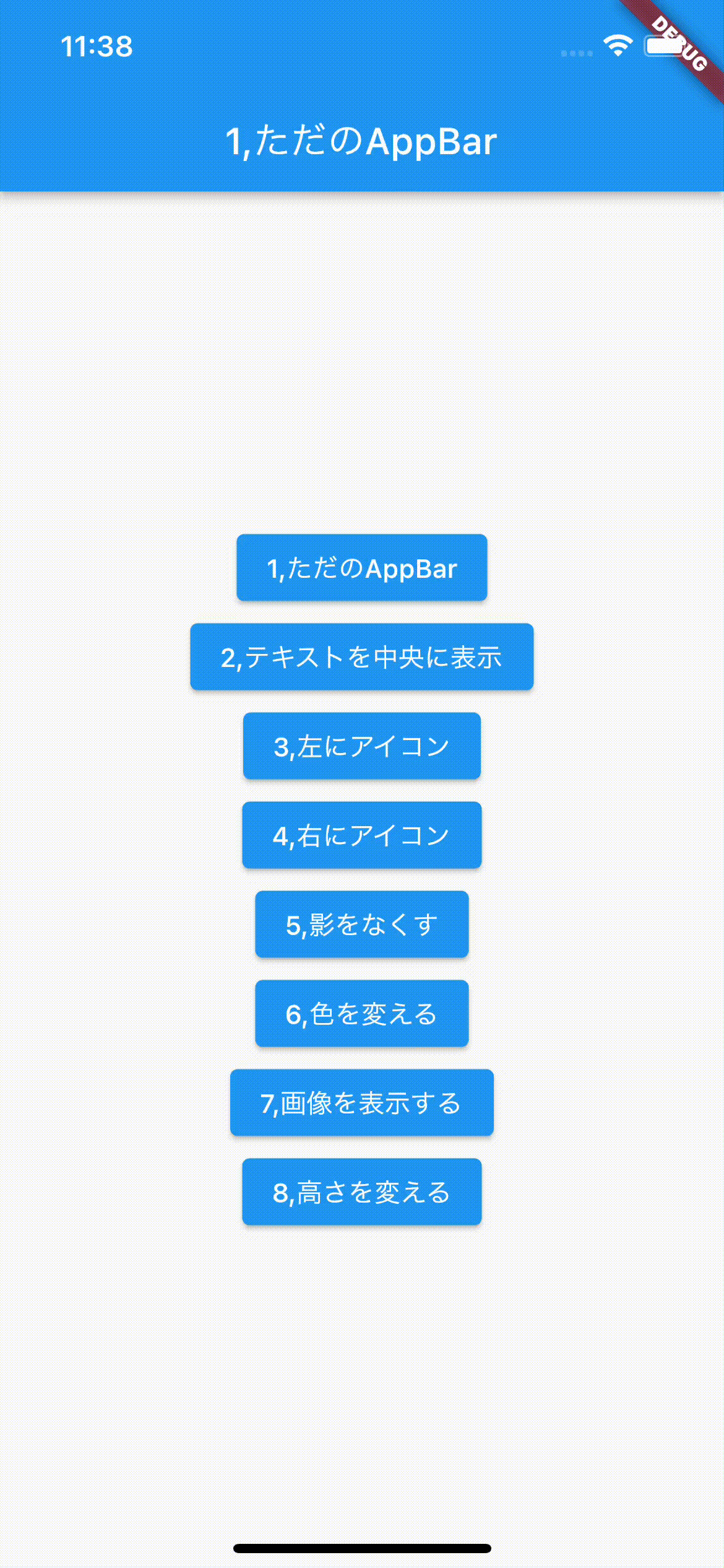
ボタンを押すとAppBarが切り替わる簡単なアプリです。
動作確認したバージョンは下記の通りです。
・Flutter 3.0.1
・Dart 2.13.3
import 'package:flutter/material.dart';

void main() {
  runApp(MyApp());
}

class MyApp extends StatelessWidget {
  @override
  Widget build(BuildContext context) {
    return MaterialApp(
      title: 'demo',
      home: Home(),
    );
  }
}

class Home extends StatefulWidget {
  const Home({Key key}) : super(key: key);
  @override
  State<Home> createState() => _HomeState();
}

class _HomeState extends State<Home> {
  // 画面に表示させるAppBarのindex
  int displayIndex = 0;

  // いろんなAppBarを格納
  List<Widget> appBarList = [
    AppBar(
      title: Text('1,ただのAppBar'),
    ),
    AppBar(
      title: Text('2,テキストを中央に表示'),
      centerTitle: true,
    ),
    AppBar(
      title: Text('3,左にアイコン'),
      centerTitle: true,
      leading: Icon(Icons.menu),
    ),
    AppBar(
      title: Text('4,右にアイコン'),
      centerTitle: true,
      actions: [Icon(Icons.add), Icon(Icons.clear)],
    ),
    AppBar(
      title: Text('5,影をなくす'),
      centerTitle: true,
      elevation: 0,
    ),
    AppBar(
      title: Text('6,色を変える'),
      centerTitle: true,
      backgroundColor: Colors.red,
    ),
    AppBar(
      title: Text('7,画像を表示する'),
      centerTitle: true,
      flexibleSpace: Image.network(
        'https://sozaino.site/wp-content/uploads/2021/10/mahou32-1280x720.png',
        fit: BoxFit.cover,
      ),
    ),
    AppBar(
      title: Text('8,高さを変える'),
      centerTitle: true,
      toolbarHeight: 150,
    ),
  ];

  // ボタン選択時に画面を更新
  void selectedButton(int index) {
    setState(() {
      displayIndex = index;
    });
  }

  @override
  Widget build(BuildContext context) {
    return Scaffold(
      appBar: appBarList[displayIndex],
      body: Center(
        child: Column(
          mainAxisAlignment: MainAxisAlignment.center,
          children: [
            ElevatedButton(
              onPressed: () => selectedButton(0),
              child: Text('1,ただのAppBar'),
            ),
            ElevatedButton(
              onPressed: () => selectedButton(1),
              child: Text('2,テキストを中央に表示'),
            ),
            ElevatedButton(
              onPressed: () => selectedButton(2),
              child: Text('3,左にアイコン'),
            ),
            ElevatedButton(
              onPressed: () => selectedButton(3),
              child: Text('4,右にアイコン'),
            ),
            ElevatedButton(
              onPressed: () => selectedButton(4),
              child: Text('5,影をなくす'),
            ),
            ElevatedButton(
              onPressed: () => selectedButton(5),
              child: Text('6,色を変える'),
            ),
            ElevatedButton(
              onPressed: () => selectedButton(6),
              child: Text('7,画像を表示する'),
            ),
            ElevatedButton(
              onPressed: () => selectedButton(7),
              child: Text('8,高さを変える'),
            ),
          ],
        ),
      ),
    );
  }
}
ビルドした時の動きはこんな感じです。
よく使うプロパティ
title
appbarの中に表示させたい要素を設定するプロパティ。
名前的にTextを指定するのかと思いきや、特にそう言った縛りは無いです。
ただ存在意義的にやっぱり一番使うのはTextだと思われる。
AppBar(
  title: Text('1,ただのAppBar'),
),
centerTitle
先程紹介したtitleプロパティで設定した要素を中央表示させるかを設定するプロパティ。
設定する型はbool。
Androidでビルドした時デフォルトだとAppBarで指定した要素は左寄せになっているので、このプロパティをtrueにすることで中央寄せにできます。
ちなみにiosでビルドした場合はデフォルトでtrueになっているので設定不要です。
AppBar(
  title: Text('2,テキストを中央に表示'),
  centerTitle: true,
),
leading
AppBarの左側に表示させる要素を設定するプロパティ。
こちらは単一のWidgetのみ指定。
(Rowとか使えば複数表示もできます。)
AppBar(
  title: Text('3,左にアイコン'),
  centerTitle: true,
  leading: Icon(Icons.menu),
),
actions
AppBarの右側に表示させる要素を設定するプロパティ。
先程のleadingとは違ってこちらは配列を設定できるので複数の要素を表示可能です。
AppBar(
  title: Text('4,右にアイコン'),
  centerTitle: true,
  actions: [Icon(Icons.add), Icon(Icons.clear)],
),
elevation
AppBarに影を付けるプロパティ。
デフォルトは4に設定されています。
0にすると影が消えて、数字を大きくすれば影が濃くなっていきます。
AppBar(
  title: Text('5,影をなくす'),
  centerTitle: true,
  elevation: 0,
),
backgroundColor
AppBarの背景色を設定するプロパティ。
AppBar(
  title: Text('6,色を変える'),
  centerTitle: true,
  backgroundColor: Colors.red,
),
flexibleSpace
AppBarの背景を設定するプロパティ。
サンプルコードでは画像を表示させていますが、Containerでも何でもWidgetを設定可能です。
AppBar(
  title: Text('7,画像を表示する'),
  centerTitle: true,
  flexibleSpace: Image.network(
    'https://sozaino.site/wp-content/uploads/2021/10/mahou32-1280x720.png',
    fit: BoxFit.cover,
  ),
),
toolbarHeight
AppBarの高さを変えるプロパティ。
AppBar(
  title: Text('8,高さを変える'),
  centerTitle: true,
  toolbarHeight: 150,
),
tips
ScaffoldにデフォルトでappBarプロパティが用意されている
ScaffoldはUIを作成する上で大元の基盤となるWidgetです。
FlutterでのUI作成はこのScaffoldを起点としてその中に各種Widgetを配置して行く流れになっています。
例えると真っ白なキャンパス(Scaffold)に色々なUI(各種Widget)を書き込んでいくイメージです。
そんなScaffoldにはデフォルトでappBarというプロパティが用意されています。
つまりAppBar自体、ほぼこのScaffoldのappBarプロパティで設定される事を前提に用意されているWidgetという認識で問題ないと思います。
...
return Scaffold(
  appBar: appBarList[displayIndex],
...
おわり
今回はAppBarについて解説してきました。
アプリを開発する上でAppBarは使われる頻度の高いWidgetなのでこの機会にぜひ使い方を覚えてみてください。
今回紹介した仕様以外も、もっと深堀りしたい方は公式ドキュメントを参照してみてください。
このブログでは他にもFlutterに関する記事を上げているので良ければそちらも参考にしてみてください。
質問やご指摘もお待ちしてますー。
 【2022年最新】現役エンジニアがFlutter初学者向けおすすめ技術書3選を紹介!
 【Flutter】Widgetのサイズを変更できるSizedBoxの使い方【サンプルコードあり】
 【Flutter】ElevatedButtonでイケてるボタンのレイアウトを簡単作成【サンプルコードあり】